Uncharacteristic Characters with Jonathan Hoefler
Tuesday, March 13, 2018, 6:30 - 8:30pm

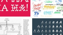
Jonathan Hoefler had never encountered a typeface in which the capital “I” needed to be taller than the “H.” But Inkwell isn’t an ordinary typeface. It’s the most uncharacteristic project ever undertaken by Hoefler&Co during their twenty-eight year history, and it questions what makes a “serious typeface” serious.
Visually, the design is unlike anything H&Co has ever done before, celebrating styles of lettering far outside their usual haunts. At the same time, it’s the quintessential H&Co project, exploring the kinds of themes that have defined some of their most familiar typefaces including Gotham, Surveyor, Ringside. This new design, by H&Co’s Jonathan Hoefler and Jordan Bell, pokes at the perimeter of the “type family,” it meditates on the relationship between the formal and informal, and it identifies how the needs of authors, as well as designers, should help guide what a twenty-first century typeface needs to be.
Admittance is free, but reservations are requested.
Jonathan Hoefler has been designing typefaces since 1989. His company, Hoefler & Co., is home to one of the world’s most distinguished font libraries, designs such as Knockout, Gotham, Mercuryand Archer that are known for both high performance and high style.
Hoefler has been awarded both the Prix Charles Peignot for outstanding contributions to type design, and the AIGA Medal, the design profession’s highest honor. A two-time honoree of the National Design Award, H&Co’s work is in the permanent collections of both the Smithsonian Institution and the Museum of Modern Art in New York.
Located in the Frederick P. Rose Auditorium, at 41 Cooper Square (on Third Avenue between 6th and 7th Streets)


